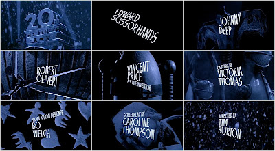
The screen shot above shows the opening title sequence for Tim Burton's, "Edward Scissorhands" movie. From start to finish, the title sequence remains dark and ominous. This is contrasted with a series of images, each title with its own image, that seem playful and almost child like and others more industrial, show metal objects such as scissors. The blue filter used creates a cold and chilling atmosphere. The use of all of those key parts creates suspense and wonder for the audience.
From the still screen shot of the title sequence, you assume the images are static. But after watching the actual sequence it becomes apparent that they are no, and parts of the sequence seem to be in a point of view shot and that the stills above are only part of the titles. the images in the sequence are zoomed out or in on during the presentation on every title.
The titles themselves are in a sans serif font in white, upper case lettering which takes up majority of the frame. Each a reflection of the angles of scissors, creating a relationship with the title of the movie itself. And allowing more information about the forth coming film to be interpreted. the titles seen show the movie title "Edward Scissorhands", the main starring actors, casting, production designer, screenplay and director. But in the full title sequence more are shown.
This title sequence appealed to me because of the strange, non connecting images and dark, cold colours used. I feel that they create an eerie atmosphere. The journey the sequence takes you on makes you want to keep watching the entire movie. I really like the use of the angle of the titles to replicated scissors and the juxtaposing images used throughout caused intrigue. In the full running title sequence, the sound used through out creates a mysterious and magical atmosphere, which the falling snow seen accentuates.
No comments:
Post a Comment