After showing our storyboard to our teacher, we realised that our title sequence wasn't fluent and didn't make much sense. In this storyboard, we have taken out the idea of flashbacks from the city to the forest. Now it is entirely in the forest, and follows the plot that a man is holding a briefcase and is being watched. He then realises he is being watched and runs, falling and dropping the briefcase. At the end we see a shot of the briefcase, the man's tie and a piece of paper floating on the lake. This end shot creates suspense because we want to know what happened to the man.
Thursday, 25 February 2010
Wednesday, 24 February 2010
match cut prelimeary exercise
In this lesson me and my group had to make a short film and then edit it, the idea was to have a practise with filming and edit before we start filming our opening title sequence to our thriller film so we could get a feel for the camera and how to edit it and make it a smooth edit and have at least three match cuts in this film to make it look like a smooth running clip.
with this film I liked the three match cut edits we had and they all came one after the other like the edit we done with Rico walking up to the door then typing the number into the door in order to get in and then opening and closing the door which I thought worked really well as it looked like it was a smooth edit and with this edit u could not tell that there was an edit there and that is the whole point of a good edit so I thought that in a practise for the 1st real time we have edited I thought it worked out really well as it was a good edit.
However as it was a practise there was some things that I thought that we could have done better like the position of the cast and the camera because in most shots with in the room there is to much space in the background or round the sides of the room which makes the characters in the film look smaller because there was just to much stuff in the background and it would look better if there was not all that space. Also we could have made the film look better when Rico is leaving the room we could have got a close up of his face and then done a pan and follow him to the door which would have looked better and then we could have got a nice edit of his face when he opened the door and this wood off made it look more professional.
I think for a practise run, we made a good attempt to make a film with three match cuts and to make them look smooth where you can not tell a match cut has taken place and i think we achieved that as all match cuts look professional. however with all practices we could always improve like next time we would know how to position people and to try and cut the space and try not to show to much in the film and only show the people in the film and a bit of the background. so for a practice run I think my group made a good attempt because we set out to do the task and have edits in the film and make it look professional and i did learn good tips in how to improve my film for the main coursework with the opening title sequence.
Tuesday, 23 February 2010
Pitch - 'The Briefcase'
This is what we, as a group, presented to our class and teacher. This proposed our ideas for the title sequence, and presented our plans in an organised way.
We felt that the pitch went well, as our teacher said that our idea was good and our ideas were received well from the class. We also felt like we presented it well as a group, as we all knew what we were talking about and felt confident sharing these ideas with the class.
The opinions of the class were very useful, as they have helped us to adapt our idea further.
Open Title Sequence Ideas:
In our opening title sequence we will see a conspicuous looking man in suit with a brief case walking confidently through the city of London. It will involve many close up and extreme close up shots of the surrounding city to establish location and give the audience a real sense of busy city life, as well as the city’s busyness being reflected in the quick editing pace we intend to use throughout the sequence. There will be use of flash back/flash forward narrative giving the audience and insight into the movie, but not giving away the plot line. This change in narrative will show the same guy not so confident, instead fearful and is the victim of something unknown to the audience; he is running through a forest, being followed by an unknown character. Dropping documents on his journey. He is unaware of where he is going and needs to dispose of important documents.
To give the opening sequence a real edge and thrilling effect on the audience we intend to use different filming/editing techniques that will allow us to distinguish the different narrative, mainly through the use of colour. During the future scenes of the movie, darker, more intense and threatening colours will be used. With only the occasional hint of colour, which is likely to be bold and eye catching e.g. red. The present day scenes will be more neutral and dull, but will have focused and close up shots of red objects, for example London transport. Sound used will also help to distinguish the different narrative. Busy city sounds will be used in the present. Whereas the future scenes will have intense and atmospheric music to represent the characters fear, creating suspense.
The opening titles of the movie will appear on the documents that are being dropped by the running character; they will flow around the frame freely, or will float in the river we hope to find on location. The movie title will ideally, be bought into the frame in the present day scenes by a huge red bus.
Monday, 22 February 2010
Planning Preliminary Match Cut Exercise:
Each group were given the exact same brief, which was to create a sequence including at least one match cut, shot/reverse shot and illustrating an understanding of the 180 degree rule. The sequence much show a character opening a door, walking into a room, sitting opposite another character, both sharing a few lines of dialogue.
There was no requirement to make this sequence "thrilling" but to give us some experience and technique in making something thrilling we decided that it would be best to aim for a thrilling sequence. After brainstorming many scenarios in which allowed us to fulfill the brief and create a thrilling effect we decided on a briefcase swap with little and not so informative speech.
Our storyboard shows an inconspicuous character walking down a corridor to a coded door, of which is zoomed into when the code is entered. The character enters the room to see someone in a chair waiting for his arrival. During the conversation between the two a briefcase is passed from under a table. The character who enters the room quickly leaves and hurries down a corridor.
This exercise was good a good introduction for the beginning of our own thriller opening title sequence. It allowed us to feel comfortable with the people in our groups and with the camera equipment and in some ways created a sense of style in the way we filmed and directed for future productions. I really enjoyed this exercise as it was educational as well as fun.
Sunday, 21 February 2010
Intro to Cameras and Health and Safety Tutorial:
For us to successfully create and opening title sequence must be able to use the camera and all necessary equipment along side it adequately, including the video camera, battery, tripod and memory cards. And so an introduction of how to use the camera and a health and safety tutorial was given.
Firstly, we were shown how to correctly assemble a tripod. Making sure all legs were the same length, correctly fastened in place and was straight, by looking at the spirit level attached. If not done correctly damage to the cameras or to ourselves could occur. Also, we were shown how to lock the camera in place to prevent any accidents with the camera. There is also a leaver that allows us to pan the camera smoothly when filming.
We were then shown how to use the video cameras correctly so that we could get used to them before filming our final thriller opening. We learned the basics of inserting the battery, turning the camera on and off properly, as well as how to use the "zoom" function and how to use manual focus and how to change from manual to auto focus. Then were shown how and where to insert the memory cards we would be using for filming. The playback function was also show to us, which allowed us to view footage previously filmed on the camera itself.
Health and Safety rules were given in order to prevent damage to the equipment and ourselves and others. These include:
- Closing the lens cap when the camera is not in used.
- Do not place near water, or if raining when using the camera bring use an umbrella to protect it.
- Do not leave the equipment unattended and make sure people are aware of the tripod.
- Carry all equipment in provided cases when traveling.
Saturday, 20 February 2010
Introduction to the Camera & Health and Safety Tutorial
In this lesson, we were given a briefing of the 'dos and don'ts' of using the camera and all the other equipment entailed with filming.
The tutorial was split in to a few sections:
1) Using the tripod: we were given a few tips as to how to get a level steady shot, how to set up and strike the tripod safely and the tip to keep people around the tripod at all times to prevent people tripping over it. This video tells you everything you need to know about using a tripod:
2) Using the camera: Bernard then told us which settings we should use on the camera, how to manually set the focus, how to switch from one memory card to the other, how to shut the lens cap and so on. The most important part of keeping the camera safe was to make sure a member of the group was supervising it at all times and to make sure it is securely locked on to the tripod.
3) Correctly inserting the battery. This is imperatively important in filming - without a battery the camera would not turn on, and there would be no film.
4) Inserting the memory card correctly and learning to switch between the storage of two memory cards
5) Using the card reader to transfer our footage from the memory card to the iMacs
6) Safely connecting the video drive, saving things to it correctly and ejecting the video drive safely! Without ejecting the video drive properly data can be irreversibly deleted, so ejecting the drive is amazingly important.
We were also told to consider things like:
- Putting up an umbrella over the camera if it rains to prevent it from getting wet
- Not letting anyone outside the group use the camera
- Keeping the camera away from busy roads or lakes (anywhere it could get accidentally damaged)
- Packing the camera into its protective case when not in use
Art of the Title Sequence - Panic Room

The title sequence to 'Panic Room' creates suspense from the onset in many different ways. Firstly, the sequence establishes where the film will take place, as all the shots show the inner city areas of New York. This makes the audience feel more knowledgeable about the upcoming film, and establishes familiarity.
The titles to the film are seen high up across the cityscape using CGI. This makes the audience feel omniscient and powerful, as they are seeing things that the people within the film would not be able to see. A serious mood is established by showing the titles entirely in bold capital letters in a serif font. This makes the titles appear more formal, which foreshadows a tense atmosphere and possibly dire situations throughout the film.
Suspense is also created by the sound played over the top of these titles. It is an orchestral soundtrack played in a minor key which continuously plays a bassy drone with small trills and flourishes overlapping it. The continuous nature of the drone connotes uneasiness, as it is not a characteristic of music we would normally hear in mainstream music.
Friday, 19 February 2010
Animatic of Storyboard
We made the storyboard for our film, then took still images of each shot. We then put them all together in Powerpoint and saved as a Quicktime file.
Wednesday, 17 February 2010
Art of the Title Sequence:

The screen shot above shows the opening title sequence for Tim Burton's, "Edward Scissorhands" movie. From start to finish, the title sequence remains dark and ominous. This is contrasted with a series of images, each title with its own image, that seem playful and almost child like and others more industrial, show metal objects such as scissors. The blue filter used creates a cold and chilling atmosphere. The use of all of those key parts creates suspense and wonder for the audience.
From the still screen shot of the title sequence, you assume the images are static. But after watching the actual sequence it becomes apparent that they are no, and parts of the sequence seem to be in a point of view shot and that the stills above are only part of the titles. the images in the sequence are zoomed out or in on during the presentation on every title.
The titles themselves are in a sans serif font in white, upper case lettering which takes up majority of the frame. Each a reflection of the angles of scissors, creating a relationship with the title of the movie itself. And allowing more information about the forth coming film to be interpreted. the titles seen show the movie title "Edward Scissorhands", the main starring actors, casting, production designer, screenplay and director. But in the full title sequence more are shown.
This title sequence appealed to me because of the strange, non connecting images and dark, cold colours used. I feel that they create an eerie atmosphere. The journey the sequence takes you on makes you want to keep watching the entire movie. I really like the use of the angle of the titles to replicated scissors and the juxtaposing images used throughout caused intrigue. In the full running title sequence, the sound used through out creates a mysterious and magical atmosphere, which the falling snow seen accentuates.
Saturday, 13 February 2010
Skills Audit: Filming and Editing Preliminary Match Cut Exercise
Before we tackle the task of creating a title sequence for a thriller, we were given the preliminary task of filming a character walking through a door, sitting opposite another character and exchanging a few lines of dialogue. The required elements of this task were: 1 match cut; shot/reverse shot; showing an understanding of the 180 degree rule.
In the brief of this task, no genre was specified. As a group, we decided to make our match cut exercise thrilling to give us more experience when it comes to filming our real title sequence. To make the scene thrilling, we decided to incorporate a bag swap (as seen in Collateral) and not include excessive amounts of dialogue - the lack of dialogue leaves the audience guessing what they are talking about and what is in the bag.
In our scene, we see a character walking down a corridor towards a door. We then see him tap in a code in to the lock on this door in extreme close-up. This character enters the room, and then faces a character that was already in the room, sitting at a table. The pair exchange a few lines of dialogue, then exchange a briefcase from under the table. After the briefcase has been given, the character gets up and leaves the room. We then see him walking back down the corridor.
Overall, the exercise was fairly successful in making us familiar with our groups and the equipment we will be using when we shoot our actual title sequence. We could have improved our editing pace to make it more thrilling, but all in all the editing was fairly good. We also suffered from a technical fault - the sound was not working on our camera. However, we will learn from this experience and make sure we check that the sound works on the camera before we start filming.
Thursday, 11 February 2010
Hello group 14
Well done so far - the blog is looking good. I'm especially pleased that there are some embedded clips from youtube - it would be nice to see lots more! Don't forget to blog about the first practice film you made; it needs uploading and blogging. Also - don't forget the Art of the Title Sequence analysis - it's really important.
have a good half term - but don't forget to plan the pitch!
mx
Wednesday, 10 February 2010
Skills Audit: Livetype and Soundtrack Pro
The task of creating a title sequence to a thriller requires many different elements. Not all these elements can be provided by Final Cut Pro, so we learnt how to use two different programs called Livetype to create the titles and Soundtrack Pro to create the soundtrack to the title sequence.
 Livetype allows you to type in a simple title and manipulate it. You can change the font, colour, size, background, movement and transition of the title to give it life and make it stand out within your sequence.
Here is a soundtrack that I made when experimenting with Soundtrack Pro. My inspiration was the TV drama 'Life On Mars' and the cop show genre. I believe this stimulus was helpful in creating a suspenseful soundtrack, as in a cop show you know that something is about to happen but you are never entirely sure what. I thought this stimulus would be a good starting point as it is taking a different approach to the thriller genre in general.
I thought that both programs were very effective in creating a title sequence, as they are both very versatile programs. You can adapt just about anything that already exists within the program to fit your purpose.
Tuesday, 9 February 2010
Skill audit: Livetype and Sound:
Our thriller opening sequence requires opening titles and an original soundtrack. We were introduced to two programs that allow us to create a title sequence and create music and sound effects for a production; Livetype and Soundtrack.
Livetype allows us to create a series of titles in various fonts, colours and sizes. With different backgrounds, effects and in different movements, that can be used in Final Cut pro and edited into our thriller opening title sequence.
 Soundtrack allows us to create original pieces of music to feature in the soundtrack of our opening title sequence. Using pre-made clips of different music genres and different instruments. Plus having the ability to change the volume of the clips, we were able to produce our own short compositions that could possibly be used in our final production.
Font Types
The type of fonts used in everyday mediums can be categorised into two fairy simple categories: Serif and Sans Serif.
Serif fonts are a more traditional and are described as formal, compared to fonts of the Sans Serif category. Serif fonts are usually used in broad sheet news papers such as 'The Times'
Examples of Serif fonts are:
Courier.
Serif fonts are a more traditional and are described as formal, compared to fonts of the Sans Serif category. Serif fonts are usually used in broad sheet news papers such as 'The Times'
Examples of Serif fonts are:
Courier.
San Serif Fonts are more informal, modern and 'Friendly', in contrast to the formality of Serif fonts.
Examples of Sans serif fonts are:
Examples of Sans serif fonts are:
Arial


News and Current Events

The search for the British couple who were feared to have been taken hostage by Somali pirates.
Paul and Rachel Chandler, from Tunbridge Wells, were sailing their yacht - the Lynn Rival - towards Tanzania, when they released a distress signal.
http://news.bbc.co.uk/1/hi/england/kent/8371854.stm this is a link for a more closer look at the situation.
I would use this because when filming a kidnapping it is very suspenseful and would be a good idea to take and use as my final peice?
Thursday, 4 February 2010
Font Types
The font that something is written in can change its mood significantly. Fonts can be classed in to 2 categories: Serif and Sans Serif.


Serif fonts are seen to be formal and are used in formal contexts. Serif fonts are used in broadsheet newspapers and old-fashioned circumstances. The name 'serif' comes from the small flourishes that are on each letter that you would not find on a sans serif font. Some serif fonts are: Times New Roman, Georgia and Courier.
Sans Serif fonts are seen to be more informal and are used in informal contexts. Sans Serif fonts are generally used across the internet as they are easier to read. It has been scientifically proven that the human mind reads sans serif fonts quicker than serif fonts, as the brain does not have to recognise the serif on each letter. Some sans serif fonts are: Verdana, Arial and Lucida Grande.
The type of font used in the title sequence of a film could help to give away to the audience the mood of the film.
The serif font used on the Titanic film poster connotes the time period that the film is set in, as the serif font represents old-fashioned attitudes. It also suggests to the audience that something serious is going to happen, as the font used mimics the font that newspapers use. This could foreshadow the events of the film somehow; the font of the title is the same as the font that was used for the newspaper article that reported the events of the film.
The upper case letters indicate that the film has very serious issues underlying the plot, and also give connotations of strength.
The sans serif font used in the Mean Girls film poster suggests that the plot to the film is light-hearted and aimed at a younger audience. This is because the font is often found on the internet - many young people use the internet.
The colour of the font is important, as it shows that the target audience is young girls - pink is stereotypically a girls' colour.
The fact that 'Mean' is bold highlights that the characters in the film will be mean, and this may challenge conventions. The title is in upper case letters. This suggests that strength is an underlying theme to the film.
Live type and soundtrack skills audit
In lesson we where told to make a Title sequence and a backing track of your choice and if it was good enough add it to our thriller piece :


Skills Audit Live Type and Sound
For our thriller title sequence we have to put in titles and sound to make it look like an authentic thriller title sequence and in order to do this we had to learn skills on how to do this and learn how to use programs such as Live type and Soundtrack pro.
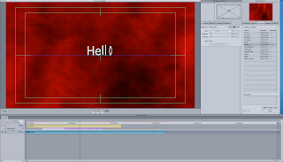
In Livetype you can create titles for your thriller and in this programs you can make them in any style you want so you can make it significant like seen in the picture "Smoking Kills"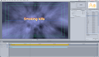 where it is orange to represent it being fire and fire is dangerous and with the background smoke it helps support the logo where smoking is dangerous and can kill. hoverer for your thriller title sequence you could change the font and make it look old or bold and many more but you can make it red to make it significant and to represent danger. So in livetype you can make the titles significant to go with your thriller you are making.
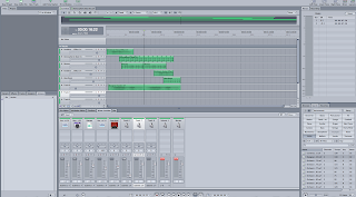
Also in this lesson we learnt how to use Soundtrack Pro where it is a programme where you can create the soundtrack for your thriller title sequence. you can make it slow music to build up tension and to make your thriller title sequence suspenseful. Also in soundtrack pro you can get special affects like big explosions or even get sounds like for a city scene which we are thinking about in using so this would be very helpful and it Will make it authentic.
Both the skills are very useful to have to make our thriller title sequence authentic and to make it look like a real production company had made this film and the soundtrack and Livetype will make our title sequence better as it will help us to gain more marks as it will look more like a title sequence.
In Livetype you can create titles for your thriller and in this programs you can make them in any style you want so you can make it significant like seen in the picture "Smoking Kills"
 where it is orange to represent it being fire and fire is dangerous and with the background smoke it helps support the logo where smoking is dangerous and can kill. hoverer for your thriller title sequence you could change the font and make it look old or bold and many more but you can make it red to make it significant and to represent danger. So in livetype you can make the titles significant to go with your thriller you are making.
Also in this lesson we learnt how to use Soundtrack Pro where it is a programme where you can create the soundtrack for your thriller title sequence. you can make it slow music to build up tension and to make your thriller title sequence suspenseful. Also in soundtrack pro you can get special affects like big explosions or even get sounds like for a city scene which we are thinking about in using so this would be very helpful and it Will make it authentic.
Both the skills are very useful to have to make our thriller title sequence authentic and to make it look like a real production company had made this film and the soundtrack and Livetype will make our title sequence better as it will help us to gain more marks as it will look more like a title sequence.
Teacher comment
I'm really happy with the quantity and quality of the blogs from this group. You all seem to have readily acquired the blogging habit and your entries are interesting and convey real enthusiasm. Keep it up.
Wednesday, 3 February 2010
Thrillers and Sub-Genres
There are many types of thrillers, however, all create suspense in different ways as they are all different types of thrillers so they plot the thrillers differnatly. such as:
Horror thrillers.
Action thrillers.
Political thrillers.
Psychological thrillers.
Religious thrillers.
Spy thrillers.
Medical thrillers.
Legal thrillers.
Crime thrillers.
Conspiracy thrillers.
Drama thrillers.
The Triller i am inspired by are horro thrillers like the red eye becuase Jackson the VILLAN been following Lisa for weeks and knows so much about her that she becomes suitably freaked out. This caught my eye because the theme of a stalker always creates good suspense.
Font Types:
The type of fonts used in everyday mediums can be categorised into two fairy simple categories: Serif and Sans Serif.
Serif fonts are a more traditional and are described as formal, compared to fonts of the Sans Serif category. Serif fonts are usually used in broad sheet news papers such as 'The Times'
Examples of Serif fonts are:
Times New Roman and Courier.
San Serif Fonts are more informal, modern and 'Friendly', in contrast to the formality of Serif fonts.
Examples of Sans serif fonts are:
Arial and Verdana
Depending on the target audience and genre of the a movie, the fonts used in the opening titles and on advertising materials will vary and are a reflection of both.
The official movie poster for Pearl Harbor uses the font 'Platino.' The use of a serif font has a more formal address toward the audience. The images give us a clue as to what the movie about, war, and the formality of the font suggests the factual nature of the events in the movie. The upper case lettering suggests strength and masculinity.

The font used in the 'Rocky' movie poster, 'Franklin Gothic Heavy', is Sans Serif. Its very strong and bold, which in reflects the personality of the main character of the movie. It also suggests masculinity through the use of upper case lettering, attracting a male dominant audience. Its striking nature instantly captures the audience.

How is suspense created

The movie 'United 93'is about an incident that happen, noticed as the 9/11 Bombings. becuase this was a real life theme it automatically plucked at the heart strings of us and we were emotionally touched by the outcome.
This film was full of suspense becuase the director made it obvious what the two men where planning to do however, we didn't no when they were going to make the the moveand hijack the plane.
On the plane we see members of the Al-Qaida keep going other to each other and asking question we think they are going to start the move but don't this happens 4 times and each time we get a gutwrenching feeling as the suspense is building.
Then finally nthey start the move and the aggression in the faces as they brutally stab passengers, this was unexpected and created climax and suspense.
Every last tiny detail used by Greengrass is drenched with unbearable tension, especially at the very beginning. Every gesture, every look, every innocent greeting, every puzzled exchange of glances over the air-traffic scopes, every panicky call between the civil air authority and the military - it is all amplified, deafeningly, in pure meaning. And the first scenes in which the United 93 passengers enter the plane for their dull, routine early-morning flight are almost unwatchable.
Monday, 1 February 2010
Font Analysis
There are only really two types of fonts which are Serif fonts and Sans serif fonts and the diffrenace in the two fonts is that they are usally associated in diffrent ways as serif fonts are usally seen in newspapers such as the times or the independent because in these newspapers they explore serious topics and issues so they will use a more serious font. Sans serif is usally used in tabloid news papers such as the sun as it is less serious topics, it is also used in sings as sans serif is seen as being clearer to read. 
When films use these two font types it will usally say a lot about the film and about the target audinece and about what the film can intail, for example in the film "RAMBO" you can tell that it is for a male audinece as the font is big and bold and red and is in sans serif and as it is big and bold it shows strenght, aslo as it is red it represent fighting and gure and blood which are all in a males film. Also the title is in block capitals which shows strenght because with it being in capitals shows the film is masculine and is therefor a male film.

Films like the Queen are best written in serif font as films like the queen is for an older auidence but mainly the film queen is based on an important historicak figure in british history so the font would have to be serif to show that it is a serious film and it is based on a very serious charcter. as the queen is based on historiacl events with the title being in serif it makes it feel more serious and feel more like a docuemanrty approach.
News and Current Affairs:
Acts of terrorism are something we, as a society, fear but at the same time has become an act in which we have come to accept could happen at any moment in time. Over recent years a number of failed and successful terrorist attacks have been performed in the UK as well as globally. After recent UK National Security investigations, it has been established that the UK is under 'severe' threat of terrorist attack. Terrorist attacks are usually the outcome of political and governmental issues/decisions disputed by the beliefs of religious fanaticism, and so the issue could evolve into an initial idea for a sub genre, political religious thriller. Maybe even illustrating features of a conspiracy thriller.
A possible plot for a thriller based on terrorism could be the failing of national security; an attack to cleverly planned and involving the most inconspicuous of people it goes undetected. Once detected a series of suspense building events, such as failed bomb attempts and hostage holding could occur. Multi-narrative perspective could be used to capture the audiences attention, clearly demonstrate actions of various characters and events taking place; successfully creating suspense through the ignorance and contrast of characters in each situation. Much like the technique used in the political thriller 'United 93', where different locations and groups if characters are shown to the audience differently. Exposing certain aspects that others are unaware of.
The reality of situations portrayed to audiences will have a great effect on the audience because of its reality and some what shocking nature of the issue. It instantly has an emotional effect and the possibility of a similar event occurring strikes fear in audiences, even if they do believe they should remain vigilant in society. Aspects raised in political thrillers like this can sometimes educate people in field they were unaware of before, though reality is sometimes exaggerated.
Thriller plots in the media?
Global warming is a permanent hot topic of conversation in the media in this day and age. Some people would argue that global warming is a conspiracy to speculate global panic and stimulate gross taxes on products like petrol, for instance. The conspiracy that is attached to global warming could make way for a riveting political-conspiracy thriller.
The plot would involve the unveiling of the information that the ice caps have not been melting at the speed that the media has scared the public with at all. This means that all evidence based on the melting ice caps would become void, and we would be back at square one in terms of global warming.
However, the audience would watch the government still feeding the population with the shock tactics that the ice caps are melting so rapidly. This would mean they would raise taxes on 'luxury items' like petrol, or ban certain lightbulbs in the hope to put global warming at bay. As the government would know that their information is false, the film could follow what the government chooses to do with the wrongly accumulated money from the taxes of petrol.
To build suspense throughout the film, a murder could occur to cover the misleading scare-mongering information that has been polluting the world for years; the government could be represented as terrorists, acting criminally to stop the breakthrough of global warming being unveiled as a myth.
The obvious conflict in the film would be between the government (trying to hide the information, keep the conspiracy going and continue raising taxes on items like petrol) and the 'hero' in the form of a confident scientist.
Here is a blog entry referring to a real-life version of my film synopsis, where a vice-chairman released false statistics relating to the life expectancy of the ice caps:
http://blogs.telegraph.co.uk/news/geraldwarner/100023818/ipccs-vice-chairman-thinks-its-glaciers-gaffe-has-increased-its-credibilty-up-to-a-point-lord-copper/

News and Current affairs Events
A news story that has been in the news this week that I could turn into a thriller is the story of a mac called Stephen Marshall, who killed his landlord called Jeffrey Howe where he then chopped him up and scatted his body parts over two counties who then adopted the nick name of the "Jigsaw man."
I think this story could be turned into a thriller film as its main theme is murder and would make a good thriller film but also I believe this story would make a good thriller film as Stephen Marshall the Jigsaw man worked for a notorious underground family called the "Adams " and with this element of gangsters and underground i think it is a good chemistry with murder to make a good thriller film.
As this films main theme is murder I think it will make a good a thriller film because with this theme you would be able to create a lot of suspense and by creating a film with a lot of suspense I think it would make a good successful movie. scenes such as where the Jigsaw man would try and kill his prey I think it would have a lot of suspense and with this suspense it would make the audience be on the edge of their seat and would therefore create a good thriller film.
Subscribe to:
Posts (Atom)